The Mortgage Reports
Overview
The Mortgage Reports is a website that provides mortgage news and advice for consumers. The website has a blog, mortgage calculators, and a mortgage rate comparison tool. Its main goal is to capture leads to sell to mortgage lenders.
I was tasked with redesigning the website because it was pretty outdated and bland. It originally had a color scheme of green and black which didn't really read well so I chose a blue color. Added in some cleaner stock photography, and more use of icons.
Launch websiteFeatures
- Redesign website to improve visual appeal and user experience
- Design mobile mockups, and desktop mockups
- Redesign the homepage and site headers and footers
- Run tests on all pages to ensure they are responsive and mobile
Technologies
- Wordpress
- HTML/SCSS
- jQuery
- Bootstrap 4
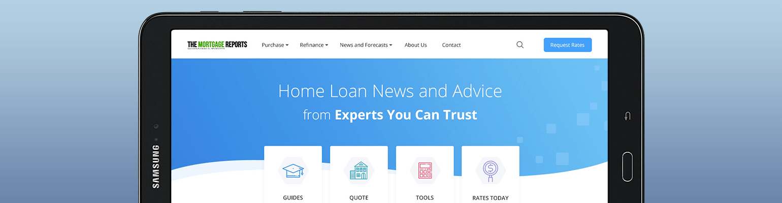
Header
Based on the color pallete, and examples of sites the company liked, I decided that a large blue background with a wave was very unique and directional buttons. We decided because users were not scrolling down the homepage very far we wanted to give them a quicker way to get around.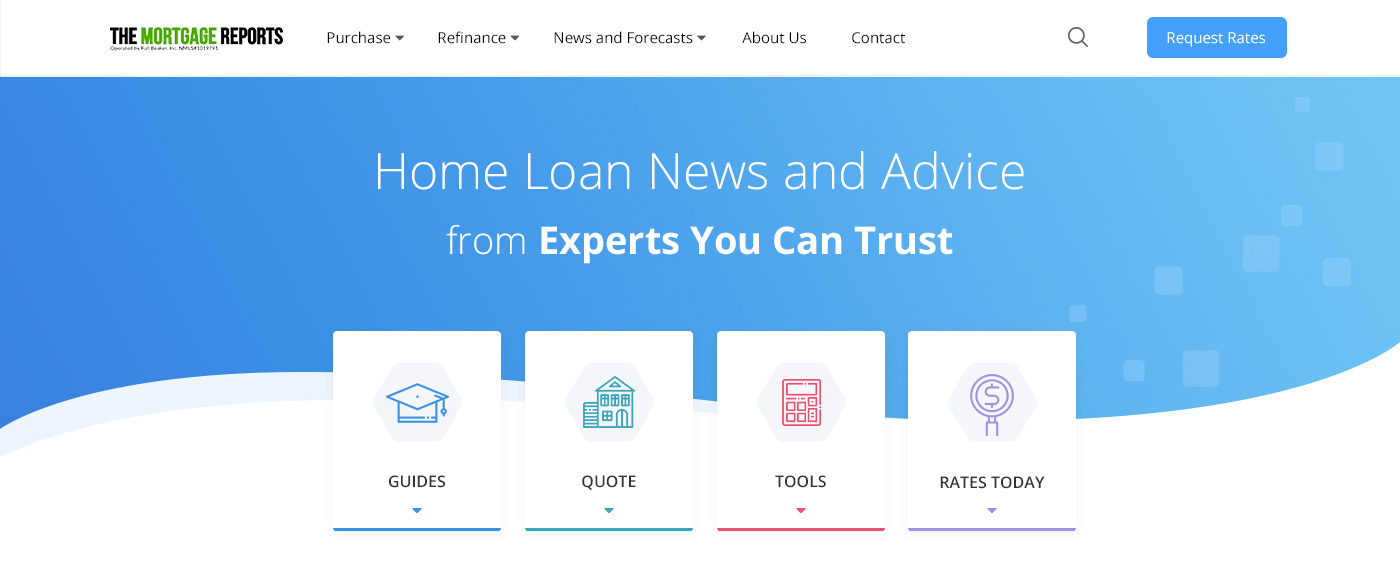
Newest Articles
Being this is an article based website we needed to make sure users found the newest articles easily, going with a 3-up carousel made the most sense because it saves space and allows users who are not interested to easily pass it by.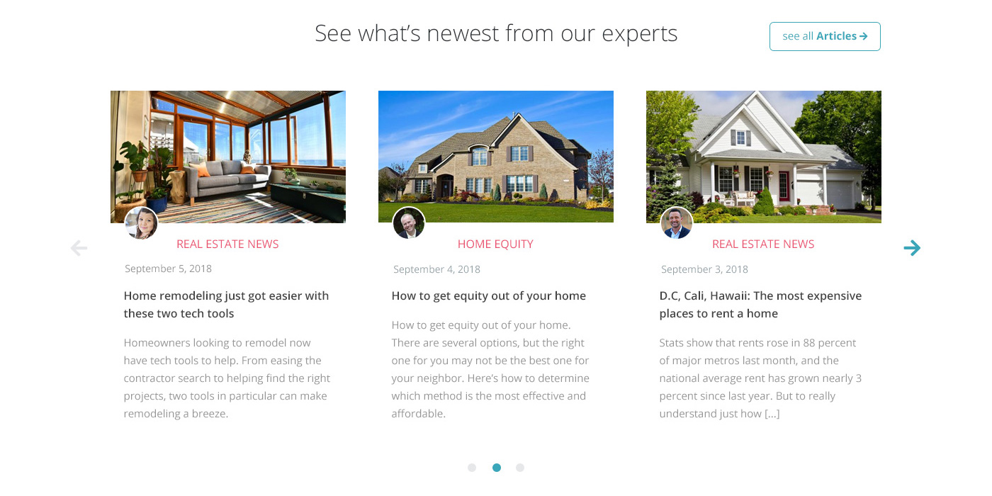
Todays Rates
The website has a newly written todays rates article every day, and many users come looking for it online. I decided to make a cool way of showcasing the newest article with just the image and simple title, this would then auto rotate every day.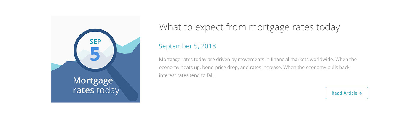
Simple Form Step
The most important area of our website is the ratequote form which users can fill out and then have lenders contact them to close deals. I decided to add one image here and not any other areas because it was an actionable area which we want users to take.
Mortgage Tools and Calculators
We have so many versions of the calculators that we wanted to give a quick way to showcase all of them. I went with a simple 3×3 grid with icons, and a short statement about each one to help the user pick the correct one.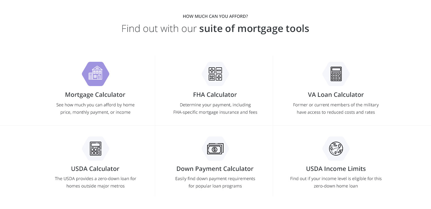
Guides Section
A newly created feature where users can learn everything they need to know about buying a home, I wanted this section to act more as a splitting of the entire website, something that contrasts everything else.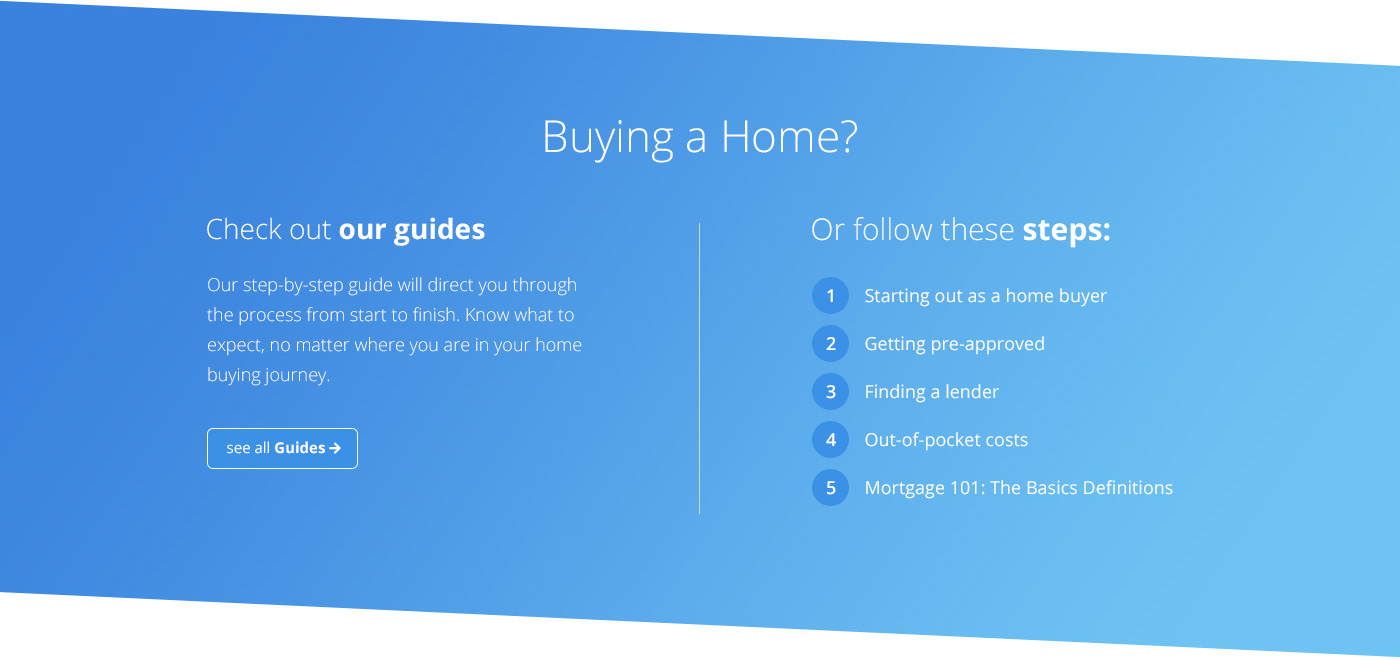
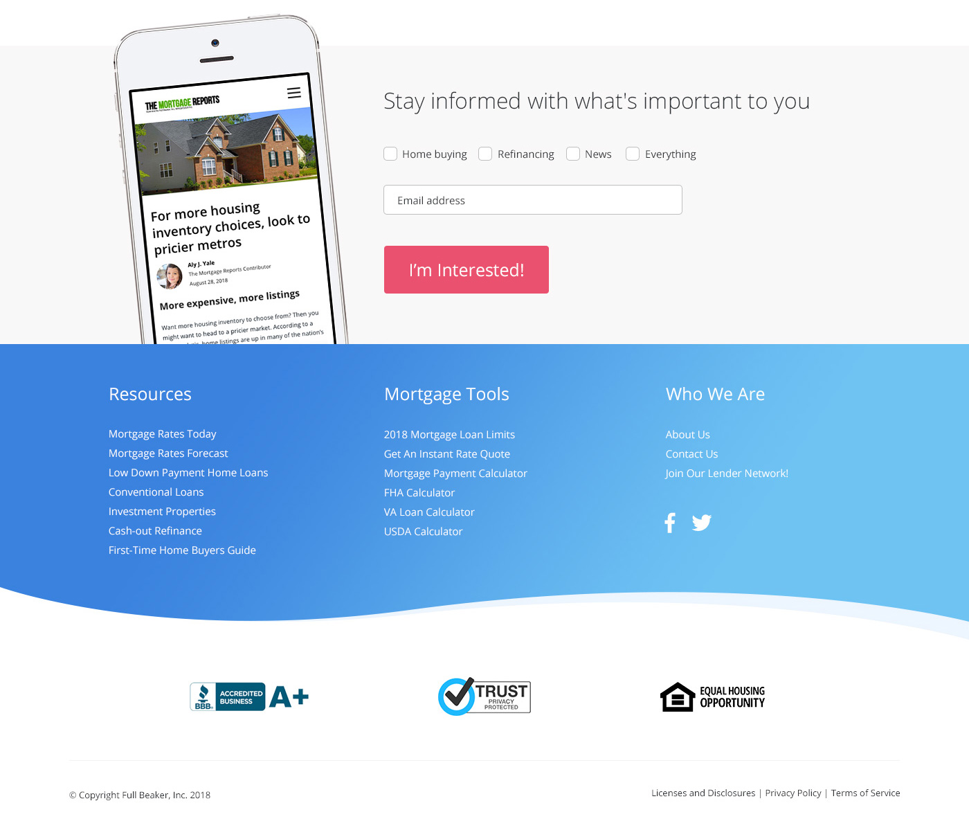
Footer
Getting users to signup and stay updated was something we knew could act as a prequel to the footer. I wanted to keep plenty of space and only the most important links to appear, also because security is important to us, and we have an A# with the BBB, I added them in as well.