Zulus Board Games
Overview
A local client with a great store front made up of fine wood ornaments, and a medieval theme. They wanted a website that would carry on the same feeling, these types of projects I always do best in. I got creative and challenged myself to make a responsive site that was high in detail, and done in a way that it could move down to mobile and still read nicely. The client loves their site and now it's my new portfolio piece!
Features
- Standard and advanced search
- Featured image slider
- Social media plugins
- Shopping cart and checkout
- Gold and wooden look
Technologies
- Photoshop, Illustrator
- jQuery
- HTML/SCSS
- Foundation 5
- Liquid (Shopify's templating language)
Header
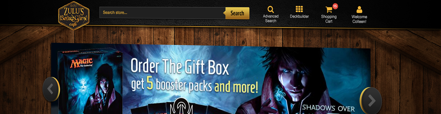
 Because of the style of the clients logo I had to base my design on blacks, gold, and treasure. I used some inspirtion from an older site I did called Threekingsloot to design this header. The header was already coded, I just made it look awesome by adding shiny gold to certain areas and a bit of leather texture. I did not want the entire header to have a texture so I used a spotlight effect for just the center.
Homepage
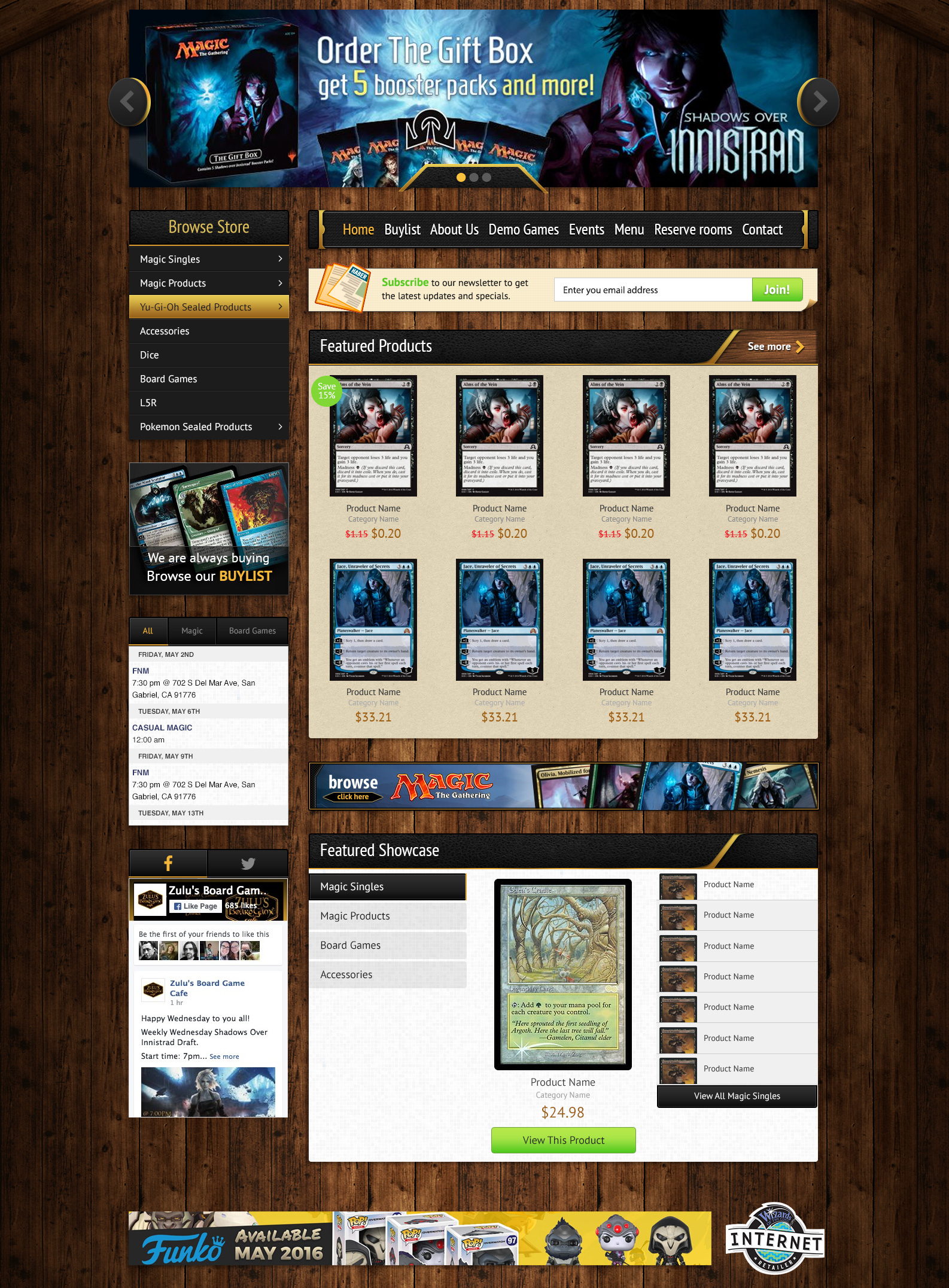
This client has a really nice location build out of vintage wood, it looked a but like the shire, and it really mattered to them that the website would reflect this. So I found some wood imagery, and made it into a Photoshop texture. I wanted the spotlight banner to span both columns due to it’s height, and made some cool buttons and pagination dots. I found that using black for the majority of the elements, and just thin edgings of gold gave it a nice look similar to their logo.
I spent some time on the heading elements for the product displays and wanted to have a mesh between the leather gold and wood. I ended up having a straight piece of wood, and having the leather appear to be folded around, just exposing the wood edge. Look cool to me so moved on.
Large product photo is always important in all of my work, and showing any sort of specials or discount blurbs helps attract buyers. Down the sidebar I added the category tree, nothing too special here just a nice gold highlight on hover. Each element was given a drop shadow to help stand off of the background.
Then of course added some social feeds, and a tabbed product showcase display, all things requested in the project.
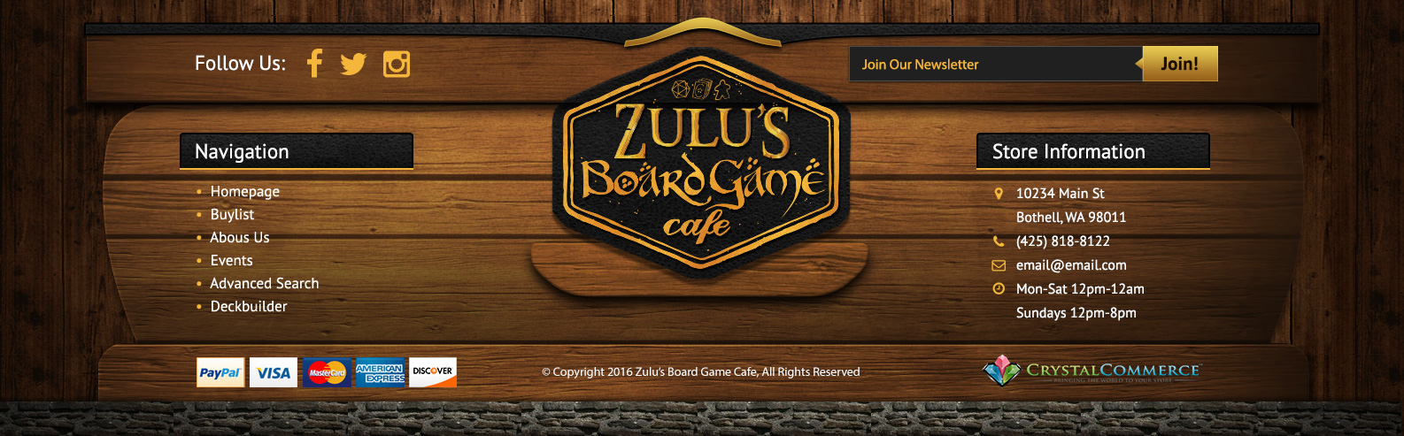
Footer
I'm still not entirely sure why I went the direction I did on this footer, my initial idea was to make it appear to be like a wooden sign, or just a section constructed from wood. I soon realized I was making a challenge for myself when it came to mobile due to the graphics needing to shrink. But ultimately I made it work by providing different graphics in mobile view, and the elements would stack underneath one another.